Designing for developers

Why it's different from designing for the common user
To someone not familiar with how software developers think, it may feel like designing for developers would not be all that different from designing for anyone else. That it's just a matter of following the fundamentals and trusting the process.
But you might end up with a product that developers hate if you simply apply prior principles. You would need to take into consideration that developers have a different mindset when using the software.
This mindset is a result of spending a lot of time developing software. Since they are the ones who develop software from the ground up, when developers want to create something which will not be used by customers and will only be used by them for development, they end up choosing functionality over design in most cases.
This coupled with the fact that they often spend a lot of time using these types of software, you get people who are very used to using software that doesn't have a good design.
Due to this, there are certain interactions in the software which developers have come to expect. If you deviate from this, it will provide them with a bad experience. Or rather fail to provide them with an experience that will delight them.
This kind of bias is not specific to developers. For example, we all have come to expect the search bar to be at the top of any website. So, if any website changes its search bar's position at the bottom, most people will have a bad experience with it.
Some examples of websites that are designed for the developer mindset
Hacker News
Hackernews is a blog that sources posts from different blogs online and presents them in a prioritized list. The priority is based on the popularity amongst its readers.
Although anyone can submit their posts to them, it's popular amongst developers and entrepreneurs to get information about technology, software and startups. And thus, the posts which bubble up in priority are the highly technical ones.
The design of their website also reflects their user base since they have made a lot of tradeoffs in design for functionality.
The following is a snapshot of their website:
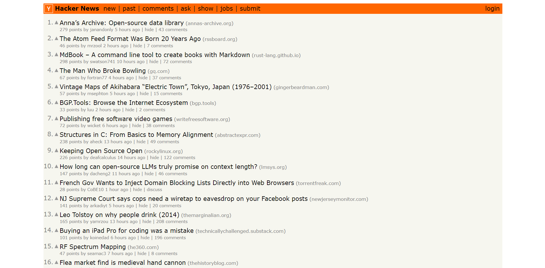
It is not very aesthetic and wouldn't please a majority of the people. But, it works well for them.
Each post is limited to a single line to fit more on the page
The posts are not allowed to add any images or use fancy words to reduce the bias of design for their users. Thus eliminating click bait articles.
It's very text-heavy, similar to the interface of command line tools (software that is run from the terminal/command prompt) which developers are very used to
By leveraging their understanding of developers mindsets, Hackernews can make an interface that is well-designed for their audience. The site would have to look much different if they wanted to make it popular amongst the general public.
HackerNoon
Hacker Noon is a blog that features articles about technology, startups, and entrepreneurship. It is a great place for developers to stay up-to-date on the latest news and trends, as well as to get inspired by the stories of other developers.
Let's look at their home page:

The choice of colors of fluorescent green and black emulate terminals with green text which are a common theme. You might have seen this in movies when a hacker uses their computer.
The style of the text and buttons is extremely plain as if it was a command line application where all the text looks the same
There is no margin on the left and right side of the panel where the articles are shown. Using every bit of real estate available at the cost of making it harder to read.
Their logo and images are in pixelated format to give sort of a retro gaming feel
All these design decisions are specifically made to delight their user base and I would say they have done a great job given the popularity of their website (They have over 5-8 million monthly readers).


